Ina Pasta
IMPACT AND TRASCENDENCE
CLIENT: MOLINOS MODERNOS • COUNTRY: GUATEMALA • AÑO: 2014
Branding Brand Strategy Logo Packaging
CONTEXT
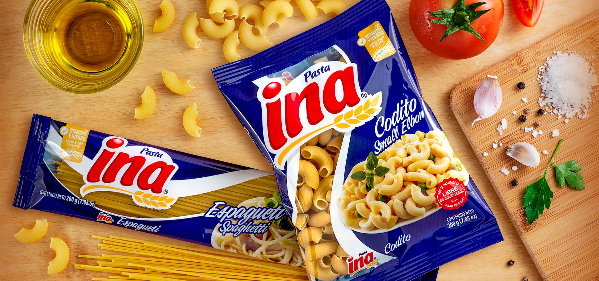
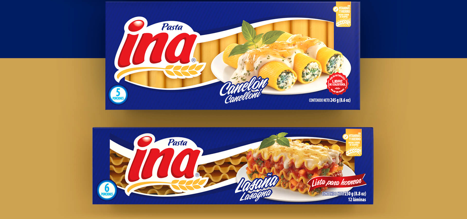
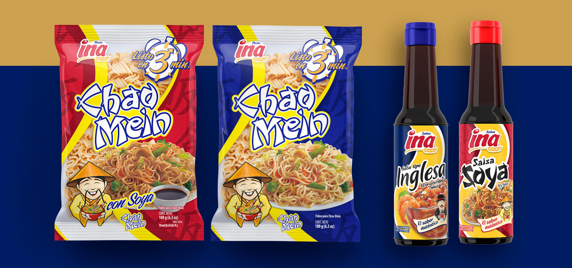
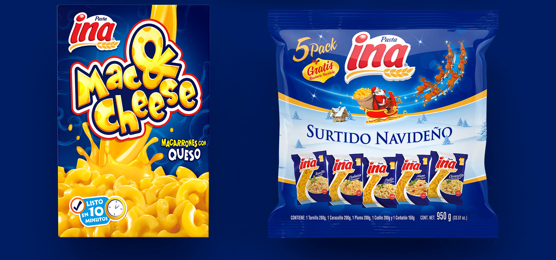
INA is a pasta brand from Guatemala that offers its consumers in Central America and the Caribbean a high-quality product that is 100% natural. Thanks to its tradition and ample variety of products, it has established an affectionate closeness with its consumers, to a level that it is known in the region as the “queen of pasta”.
THE CHALLENGE
Although its consumers recognized the high quality of INA pasta, the brand´s value had decreased, and it was overshadowed by competitors that were more and more aggressive. The change initiatives presented in that time were not enough, the brand was losing presence in audiences that were younger, also, it was limited only to generations that recognized it and were not willing to change brands.
¿How can we talk to new generations without losing the brand´s strong origin?

THE RESULT
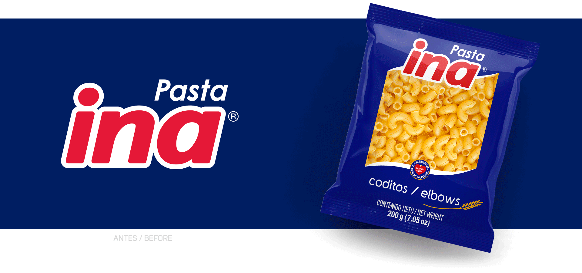
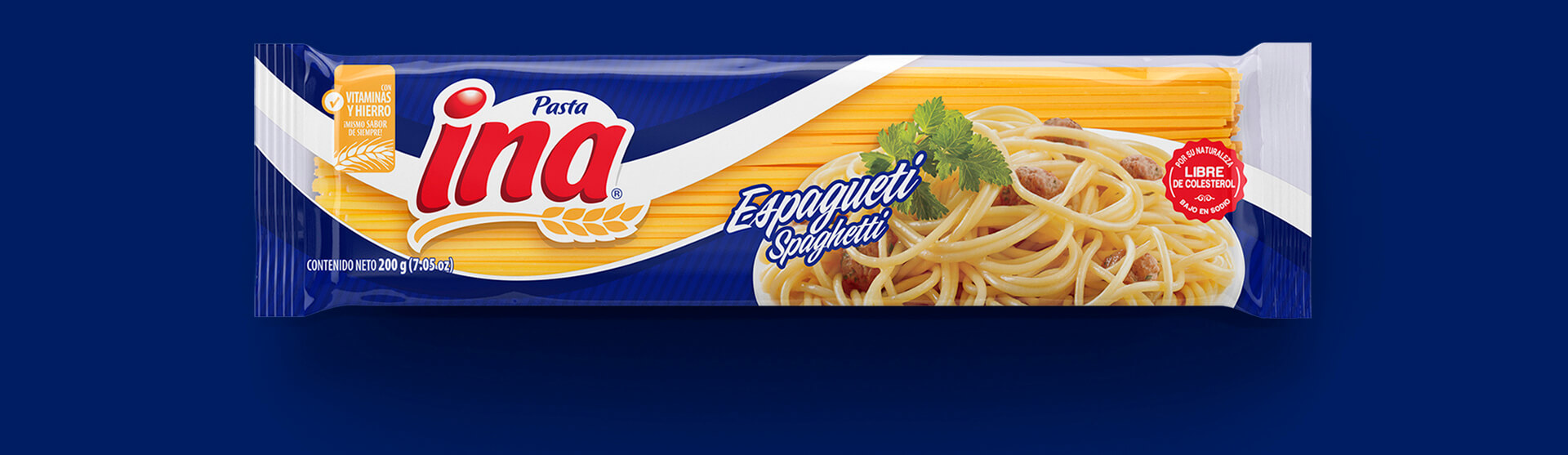
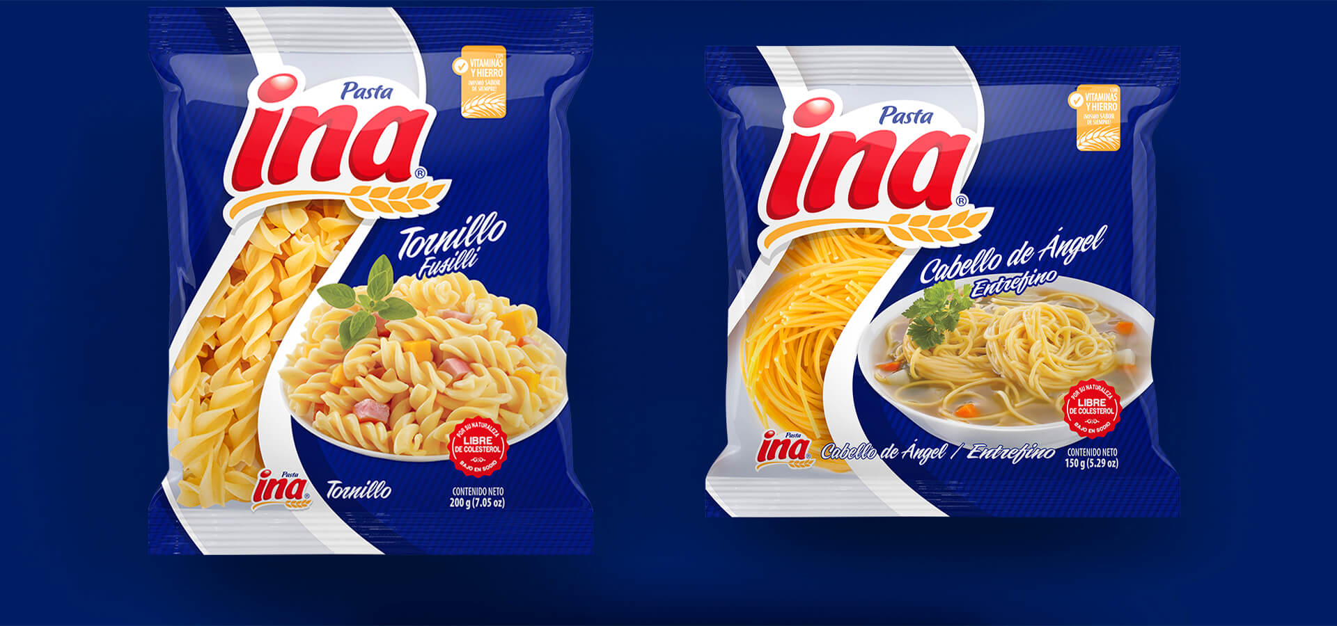
Starting from an extensive analysis, a redesign of a wide variety of INA products was engineered. This was done based on a visual image that portrayed quality, practicality and versatility. The brand was turned into the great ally in the kitchen of the modern and pragmatic homemaker. The redesign of its logo and packages were engineered to recover its recognition in Central America´s families as a close and empathetic brand.
Today, the queen of pasta has reclaimed its throne and continues to build loyalty and leadership in the display racks inside the stores of Central America and the Caribbean.


